A New Tool Shows What War Has Done to Ukraine’s Forests
Translations:
Access The OSINT Forest Area Tracker here. You can read a concise summary of the tool on the GitHub repository.
Among the many victims of Russia’s full-scale invasion of Ukraine are some of the most important ecosystems in Eastern Europe: Ukraine’s forests and protected areas.
The full extent of the damage, however, is unknown. That’s why we are launching a new tool that will help open source researchers track destruction from afar.
In September 2022, Ukrainian environmental researchers visited national parks — which are more resilient to climate change than artificial plantings and support crucial biodiversity—to assess damage to forests and wildlife. Initial findings revealed broken trees, damaged root systems due to trench digging and unexploded munitions scattered across protected lands.
“Forests have suffered a lot on the frontline… huge areas of forests are being mined”, Yehor Hrynyk, an environmental campaigner at the Ukrainian Nature Conservation Group, told Bellingcat.
But large parts of Ukraine’s vast national parks, mountainous regions and woodlands are inaccessible for on-the-ground environmental monitoring.
That’s where open source techniques come in.
The OSINT Forest Area Tracker
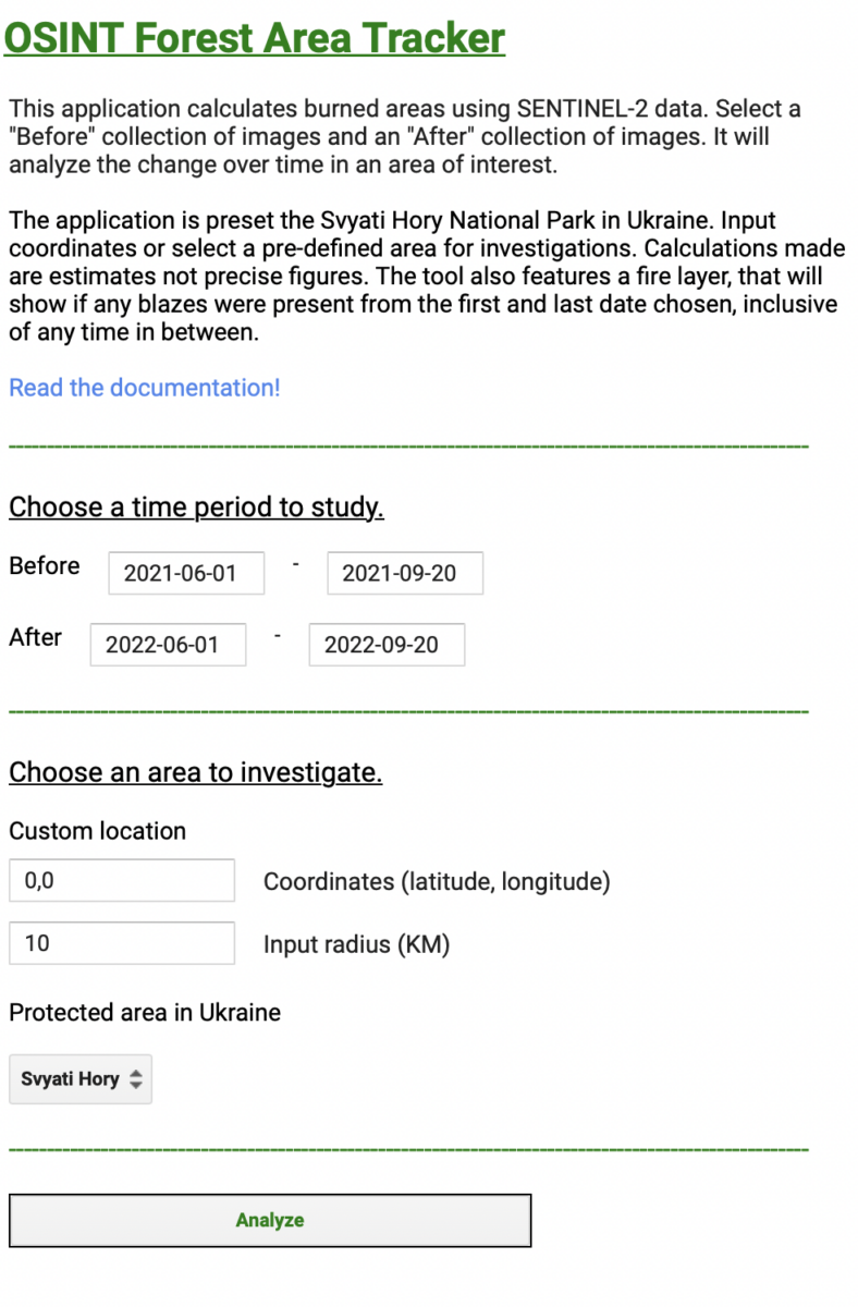
We’ve launched the “OSINT Forest Area Tracker”, hosted on Google Earth Engine. Our tool compares data collected by Sentinel-2, a satellite which detects changes in infrared wavelengths and can be used to study the health of forests.
The tool reveals the scale and intensity of anomalous changes on land. This narrows down search areas for researchers working on environmental damage in Ukraine.
Importantly, the map does not attribute the cause of these changes, meaning that it is crucial to find corroborating evidence from other sources before concluding that they were the result of military activity.
The tool uses the Normalised Burn Ratio (NBR) index to estimate burn severity.
Researchers can also use the tool to select custom date ranges for geographic locations of interest.
As Ukraine’s official database of protected areas includes over 7,500 sites, we chose not to study them all — among their number are botanical gardens, city parks and archaeological sites. That list also includes many areas in the far west of the country which have not seen intense conflict.
Therefore, we selected 16 areas which featured the highest number of detected fires over the first year of the war, based on Moderate Resolution Imaging Spectroradiometer (MODIS) data. MODIS is a sensor which allows satellites to detect thermal anomalies, including fires in active war zones (Along with VIIRS, MODIS data can be accessed on the FIRMS system; you can read more about its use to open source researchers here). We also added Svyati Hory National Park because of its proximity to fighting.
The tool includes a drop down list preset areas from across the country, including those near military activity. These preset areas are referred to by their acronyms, for example SHNP for Svyati Hory National Park. A full list of these acronyms can be found on the tool’s GitHub page.
If researchers are interested in areas of the country not included in the dropdown menu, the coordinates can be entered manually.
While the new tool focuses on Ukraine by default, the methods it employs could be used to analyse areas elsewhere in the world.
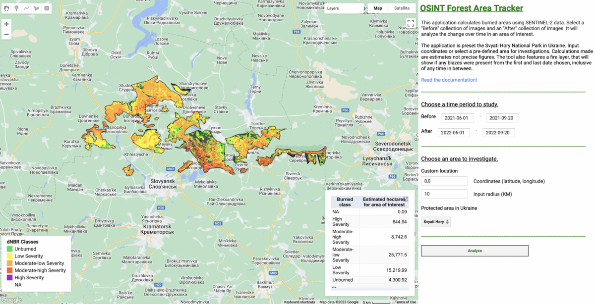
Damage to the Svyati Hory Forests
To show you how the tool works, let’s assess Svyati Hory National Park, a protected area in Eastern Ukraine.
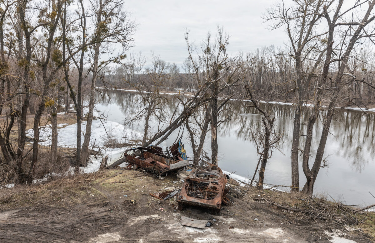
This forested area, also known as the Holy Mountains National Park, is set against rolling hills in the north of Donetsk Region, near the borders with Kharkiv and Luhansk Regions. It’s famous for the Sviatohirsk Lavra Monastery which lies along the Siverskyi Donets River — which divided Russian and Ukrainian forces for several months until a Ukrainian counteroffensive.
In May 2022 the Ukrainian Nature Conservation Group (UNCG) raised concerns about the impact of fighting in this region. So what can The OSINT Forest Area Tracker tell us about it?
We can look for possible damage to the forest by comparing data from before the invasion in 2021 and during the invasion in 2022. It is usually best to compare the same time periods to account for seasonal changes. We wouldn’t want to compare summer in Ukraine 2021 with winter the following year – the vegetation and tree canopy would not be comparable even in the absence of armed conflict.
The image below displays the difference in NBR (dNBR) from June 1, 2021 to September 20, 2021 compared to the same time period in 2022.
How the Tool Works
The OSINT Forest Area Tracker runs on Google Earth Engine, a geospatial platform that allows researchers to analyse remote sensing data by importing datasets from a range of satellite sources. These include true-colour images as well as colours that represent infrared wavelengths can be mapped onto the Earth’s surface. These different datasets are suitable for studying a wide range of characteristics such as temperature or moisture, which you wouldn’t see as easily in standard photographs.
Sentinel-2 Satellite and Calculating Normalised Burn Ratio
The data that the Forest Tracker uses comes from the Sentinel-2 satellite, which collects near-infrared (NIR) and shortwave infrared (SWIR) bands when orbiting the globe. When an area is burned, NIR reflectance decreases due to the loss of vegetation, while the SWIR band increases.
The calculation that gives us a Normalised Burn Ratio is (NIR – SWIR) / (NIR + SWIR). The figure ranges from 1 to -1, with negative values indicating burned areas or damage. Therefore a high NBR value (indicated by green pixels) can indicate healthy vegetation while a low one (red pixels) can indicate bare ground or burnt areas.
We say ‘can’ because fires aren’t the only influence on NBR results. Drought, logging and climate conditions may also contribute to changes in NBR. This is why the term ‘unburned’ needs to be understood in context and shouldn’t always be taken literally.
The tool is built to only present data across areas where you’d expect to find forests and excludes areas NBR is not effective at studying such as buildings and roads. This is achieved by only displaying readings in areas which the Dynamic World dataset classes as forested—even within the boundaries of the aforementioned protected areas.
Corroborating findings with other methods, such as social media reports, true-colour satellite imagery, fire data or local witness testimony can substantiate the cause behind a negative NBR rate.
This is why the tool alone may not give you the answer for why an area may have changed, but it can tell you where to look. It’s best used in conjunction with other research methods.
Creating a “Before” and “After” and Comparing Time Frames
The tool calculates an NBR for a “before” and “after” collection of images. It then displays the delta Normalised Burn Ratio (dNBR); delta refers to the difference between the two data points. With dNBR we can establish the extent of change in forests between two time frames.
The desired time frame for comparison can be selected in the right-hand column of the tool below. It’s important to select periods of time to compare – this allows the tool to draw from a wider range of satellite remote sensing data for increased accuracy.
A greater quantity of images is likely to yield better evidence of anomalous changes, rather than regular changes like those involved in the ploughing of agricultural land or the loss of the tree cover in deciduous forests during winter.
It’s possible, particularly during winter months, that large areas for analysis could be obscured by clouds. A technique called masking has been used in the development of the tool to minimise cloud interference in results.
Google Earth Engine also makes it possible to use this method with data from multiple satellites, including Landsat. However, our tool draws on the Sentinel-2 satellite as it has relatively recent data available to import, allowing us to analyse events from the past few months.
These parameters of the Sentinel-2 satellite allowed us to produce a map which shows dNBR by displaying colours that indicate different levels of destruction of forested areas.
You can read more about the tool and the NBR index on the GitHub repository.
As you can see by zooming in, the results in the Svyati Hori National Park seen above include extensive areas that appear to show severe forest disturbance. Note the red pixels along the southern edge of the surveyed area.
The red and purple pixels show particularly hard-hit areas with low dNBR values, especially close to the Siverskyi Donets river. However, the cause is unconfirmed; this could indicate burning and deforestation. In early August 2022, open-source researchers geolocated extensive shelling near the same river.
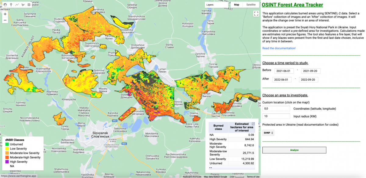
We can further check our results by running the same analysis but instead of comparing 2022 with 2021, we can compare 2022 with 2020 and 2019.
The results follow the same pattern that appears to suggest widespread disturbance to areas across large parts of the national park.
These results give us an even longer-term assessment of the forest’s health. They further indicate the scale of the changes seen in this forest is indeed anomalous.
By comparing groups of remote sensing satellite data gathered within a few months of each other, we can also use the application to see the more immediate impact of fires or forest damage.
For example, the screenshot below shows a comparison of a collection of imagery between April 1, 2022 and April 20, 2022 to a collection from just two months later between June 1 and June 30.
There’s less red to be seen than in the previous comparison, particularly around the southernmost edge of the protected area along the Siversyi Donets River. This doesn’t mean that the area is unchanged, ratherthe scale of changes is minimal in the short period surveyed.
To the south of the city of Lyman, it’s possible to see yellow and orange colours within a protected area.
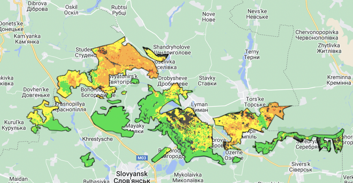
An anomalous moderate or severe change within such a short period may be more easily attributable to a specific cause.
Indeed, looking at the same area on MODIS, fire data shows numerous fires detected around May 2022 in and around Svyati Hory National Park. Several of these areas coincide with the yellow and orange areas seen in the image above.
Checking one of these areas on satellite imagery on the dates shown in MODIS yields visual indications of fires in forested areas.
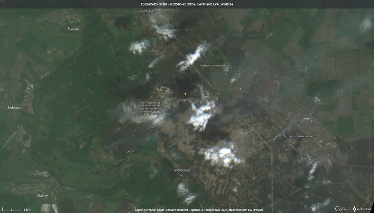
In this case, the tool has shown us where to look, narrowing down the entirety of Ukraine’s territory to selected protected areas, and then to a specific part of one of those areas where anomalous changes were seen.
Again, the cause of these fires cannot be established through this tool alone and may need to be established with other open source material or by reporting on the ground.
A Fire on the Kinburn Spit
The damage to the Sviaty Hory forests was discovered by first searching the protected area using this tool and then checking on MODIS and satellite imagery. However, the tool is also useful when a researcher already knows where to look and seeks to verify claims of damage to a specific protected area.
Eyes On Russia, a conflict monitoring project led by the Centre for Information Resilience with input from Bellingcat, has been verifying attacks, troop movements and battles by analysing footage from social media. Its researchers have already verified thousands of incidents during Russia’s invasion of Ukraine based on open source information.
By importing the Eyes on Russia dataset into QGIS, a free open source geographic information system (GIS) application, we can analyse which verified conflict events have happened inside or near protected areas. We can do this by running a “count-point-in-polygon calculation” in QGIS, which counts the number of geographic points – in this case, locations of conflict events – inside each protected area.
For this analysis, we created a one-kilometre buffer around the perimeters of the protected areas to capture conflict events that may have taken place nearby. Some events may have been geolocated just outside a national park, for instance, but activity could have had some impact inside these areas, such as the spread of wildfires or the digging of trenches.
The protected area that featured the highest number of verified conflict events in the first year of the war was around the Dnieper Estuary, close to the city of Kherson. The area stretches along and around the river as it flows towards the Black Sea.
The Kinburn Peninsula in southern Ukraine sits at the estuary of the Dnieper River. It’s an area of significant strategic importance given its proximity to the Black Sea and the Port of Mykolaiv. It’s also an area of environmental importance, home to the Black Sea Biosphere and the Ivory Coast of Sviatoslav National Nature Park.
By reviewing publicly-available data of conflict events gathered by the Eyes On Russia conflict monitoring group, it’s possible to see both where fires have taken place, and if there could be a connection between hostilities and damage to environmentally protected areas. The OSINT Forest Area Tracker allows us to assess potential links with military engagements and their impact on protected areas over shorter time frames.
In late July 2022, the Eyes on Russia team verified open source imagery showing shelling. The Telegram post included several images of trees ablaze which it claimed had been caused by shelling.
“On July 30, from approximately 11:00 a.m., the Kinburn Spit was subjected to methodical artillery fire: 3-4 attacks on one point… The forest caught fire almost immediately.”
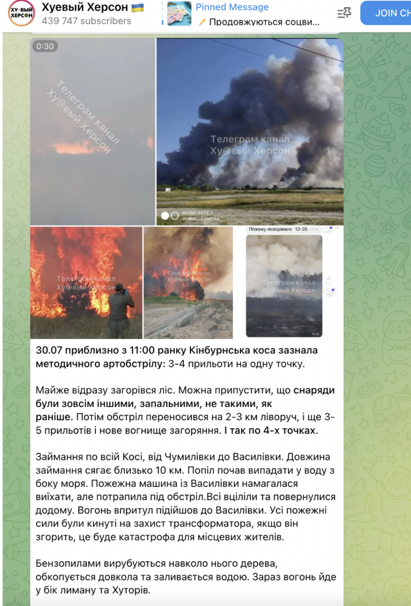
Using visual clues in the imagery and fire detection data, open source researcher @davidnewschool geolocated the incident, which took place near the village of Vasylivka on the Kinburn Spit.
The imagery shared by David in his post on X, the social media site formerly known as Twitter, reveals damage to the area. However, there are limits to what true-colour satellite imagery of the type on the left can reveal.
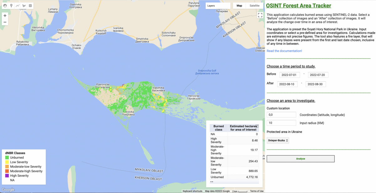
Using dNBR readings in the OSINT Damaged Area Tracker allows us to additionally see which areas appear to have experienced the most severe damage in this protected region.
When we compare imagery between 1 July 2022 to 20 July 2022 and 10 August 2022 to 30 August 2022, the tool shows us that areas of low to moderate burn severity appeared in this protected area following the attacks. They are the yellow and orange areas seen below.
Future Development
In the case of Svyati Hory, the tool identified damage to a protected area which deserved further investigation. In the case of the Kinburn Spit, it allowed us to further verify existing open source claims about an attack which had caused damage to a forest – also enriching our knowledge about the extent of the damage, which was less easily visible on real colour satellite imagery.
However, both cases demonstrate the importance of corroborating the tool’s findings with other sources before drawing any conclusions about the causes of such damage.
The author will continue refining and improving this tool in order to better understand the scale of damage to Ukraine’s many protected areas. Feedback or suggestions for improvements are welcomed.
For further technical details on this tool and updates following the publication of this article, please read the description on the author’s GitHub page.