The Story of a Storm Part II: Visualising Conflict and Displacement Data
Extreme weather events are increasingly forcing millions of people from their homes. Last year, floods and storms caused more people to be internally displaced around the world than war or violence.
Driving food insecurity and competition for resources, climate change can also indirectly intensify conflict risks.
Analysing trends in both climate and conflict data is therefore not only critical for humanitarian response teams but also for journalists and researchers looking to understand the compounding impacts of weather-related hazards and violence on displaced communities.
In Part One of The Story of a Storm we showed you how to turn raw climate data into visualisations using NASA’s Giovanni tool and to plot it with Google Earth Pro Desktop.
In Part Two, we’ll focus on conflict and displacement data.
Using event data from the Armed Conflict Location & Event Data Project (ACLED) and geospatial information from OpenStreetMap (OSM), we will further analyse our case study from Part One – Cabo Delgado, a coastal province in the north of Mozambique.
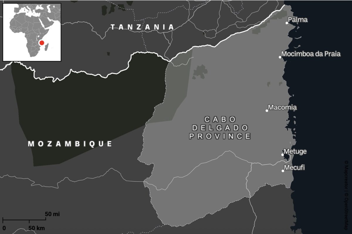
Cabo Delgado is a region besieged not only by cyclones but also by years of conflict. What began in 2017 as a series of localised attacks by Islamist militias has since escalated into an ongoing regional civil war between government forces and the Islamic State Central Africa Province (ISCAP). Close to a million people have been displaced, with extreme weather events including Cyclone Kenneth in 2019 and Cyclone Gombe in 2022 only adding to the unfolding humanitarian disaster.
Step 1: Sourcing Conflict Incident Data
Armed Conflict Location and Event Data (ACLED) provides real-time monitoring of global political violence and unrest by providing geo-referenced records of protests, riots, and violence targeting civilians.
Most of ACLED’s data originates from public sources, including local media reports and social media posts, making it heavily dependent on the presence or absence of local journalism. This reliance can create gaps in the data. However, on occasion, ACLED may also gather intelligence from local partners on the ground.
Each event entry includes key attributes such as dates, locations, involved actors, casualty figures and event descriptions. The data can be downloaded as CSV files with XY coordinates for spatial analysis. It is important to acknowledge that these coordinates often represent approximate locations, frequently defaulting to the nearest city centre rather than the precise location, which reduces spatial accuracy for detailed analysis.
To download ACLED Data in CSV format, you will first need to create a free account. You will then need to generate an access key before navigating to the Data Export Tool.
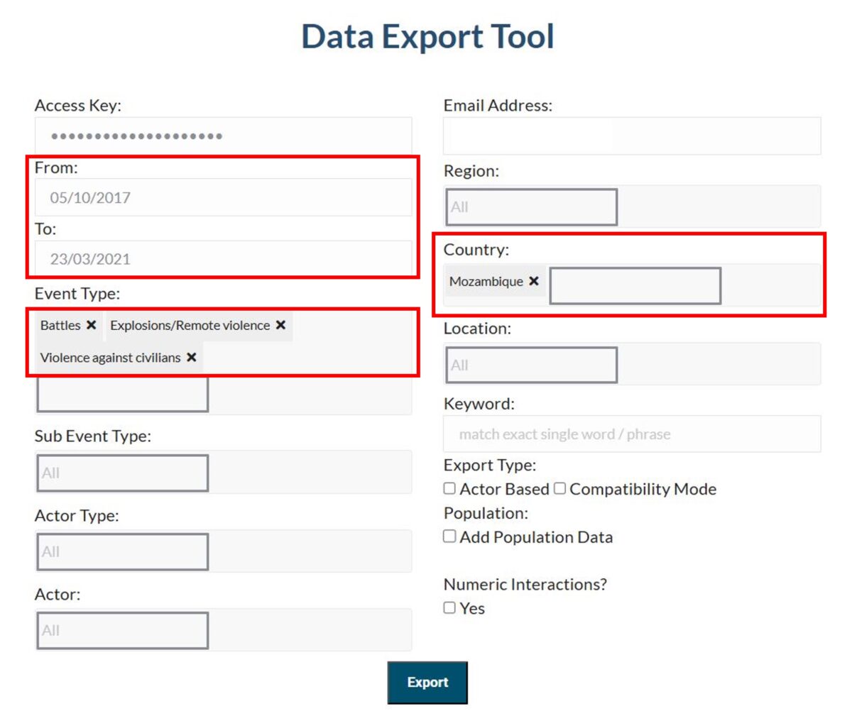
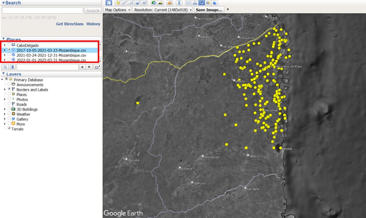
Given the complexity and longevity of the conflict in Cabo Delgado, with incidents dating back to 2017, we have chosen to split our data capture into three distinct time periods, described below. Each period will produce a separate CSV file, which, when uploaded to Google Earth Pro, will generate a separate data layer on the map.
Each time period reflects a shift in the level of violence and resulting displacement patterns of the community over time.
Period 1. Oct. 5, 2017 – March 23, 2021: Gradual Displacement
The first attacks begin in the northern districts. A steady flow of Internally Displaced Persons (IDPs) arrives further south, in and around Metuge.

Support Bellingcat
Your donations directly contribute to our ability to publish groundbreaking investigations and uncover wrongdoing around the world.
Period 2. March 24, 2021 – Dec. 31, 2021: Peak Displacement
A large-scale attack on the town of Palma in March 2021 results in the displacement of more than 100,000 people.
Period 3. Jan. 1, 2022 – To Date: Post-Peak
Following the recapture of Palma and Mocimboa da Praia by Mozambican and allied forces, some IDPs begin to return to their homes.
To export the data navigate to the Data Export Tool and enter the information below, repeating this step for each time period:
Event Type: Battles, Explosions/Remote violence, Violence against civilians
Country: Mozambique
Date Range (From and To):
05/10/2017 – 23/03/2021 (Period 1: Gradual Displacement)
24/03/2021 – 31/12/2021 (Period 2: Peak Displacement)
01/01/2022 – To date (Period 3: Post-Peak)
Step 2: Mapping Conflict Data in Google Earth Pro
Launch Google Earth Pro on your desktop. In the top menu, click File → Import.
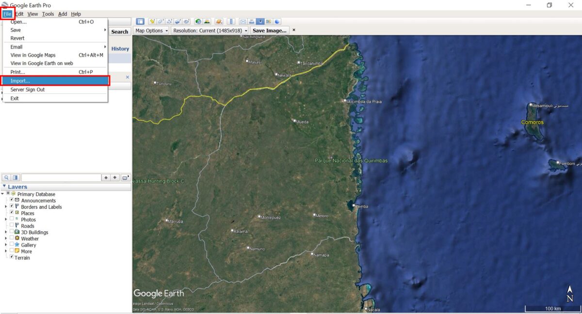
Navigate to one of the downloaded ACLED CSV files and select it. The pop-up window, Data Import Wizard, will appear.
Select Field Type: Delimited.
Choose Comma as the delimiter.
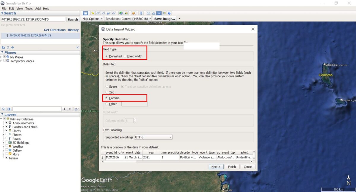
Click Next and leave the other settings as they are (ensure that the Latitude and Longitude fields are correctly selected). Click Finish to import the file.
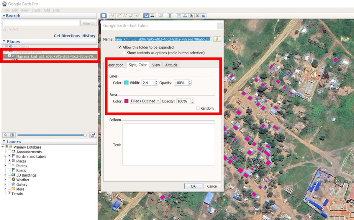
Step 3: Save and Style the Data
A new layer will appear below Temporary Places and Google Earth Pro will automatically display the imported points in the map. If they don’t appear, make sure the box next to the layer is ticked.
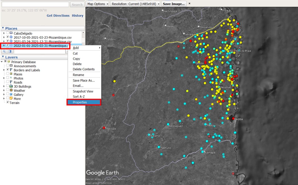
Right-click the dataset and choose Save Place As… to store it as a KML or KMZ file.
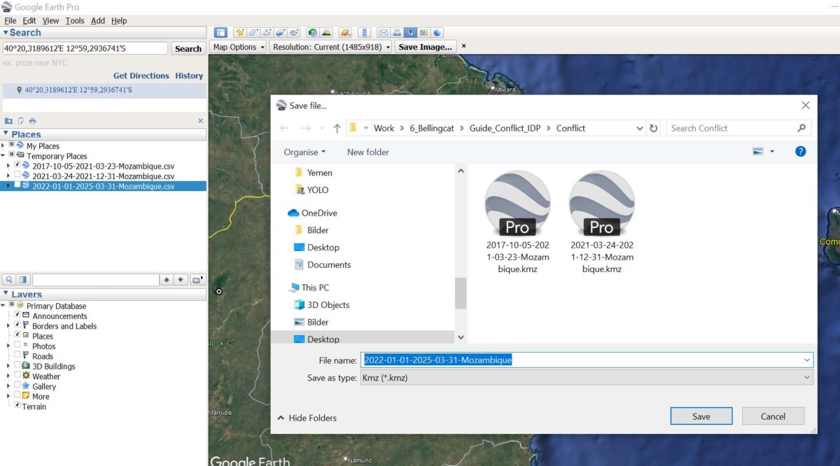
Repeat Steps 2 and 3 for all the ACLED CSV files you have downloaded.
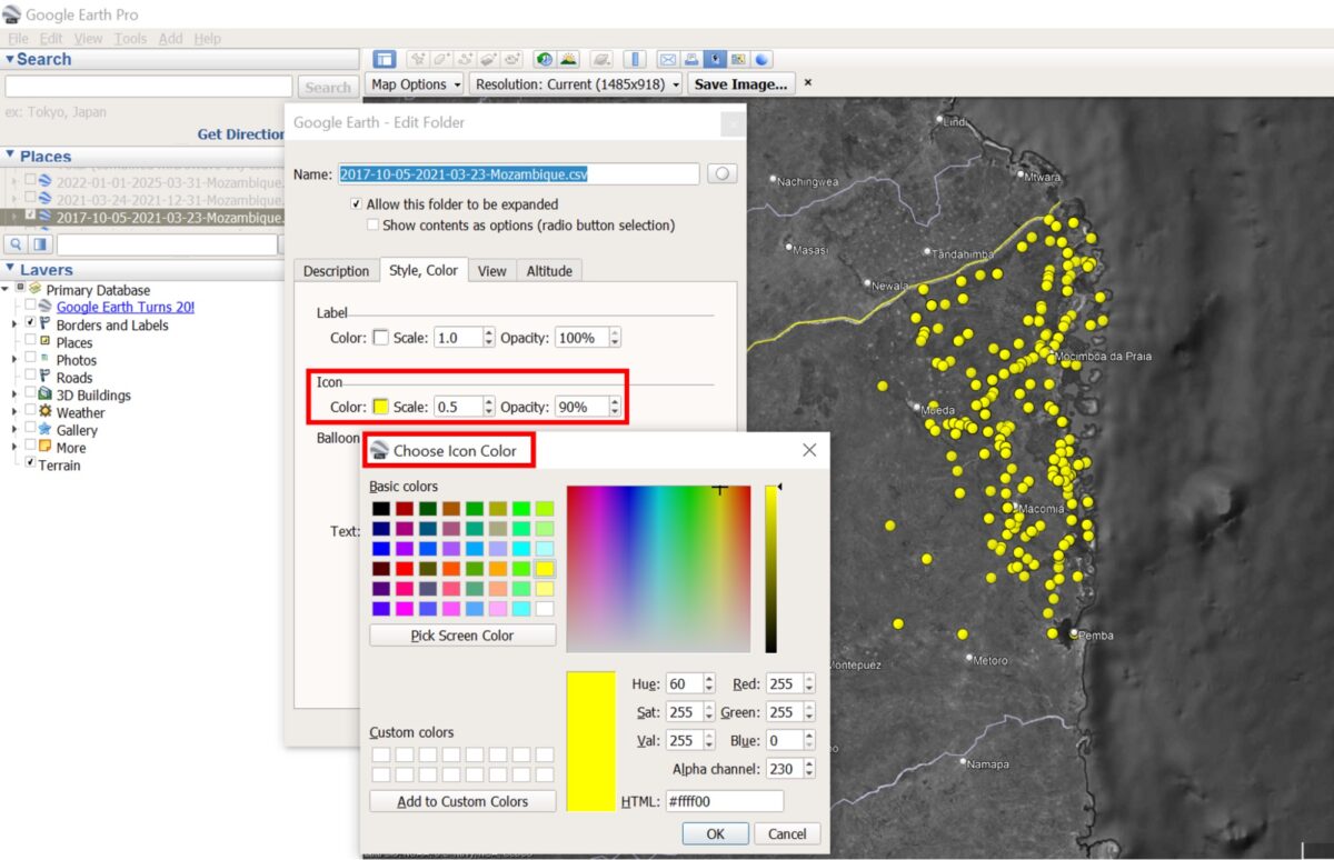
To change the icons or colours, right-click the layer file, Select Properties, then modify the Style/Color settings.
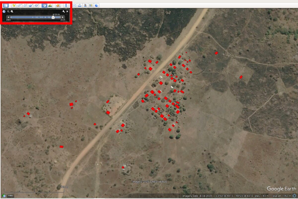
Step 4: Explore the Data
Click on any point to view details of the event, including the date, type, and location.
Be aware that ACLED may record multiple conflict incidents at the same location, so events can appear stacked on the map.

Toggle the time-period layers on and off to analyse spatio-temporal changes in conflict patterns.
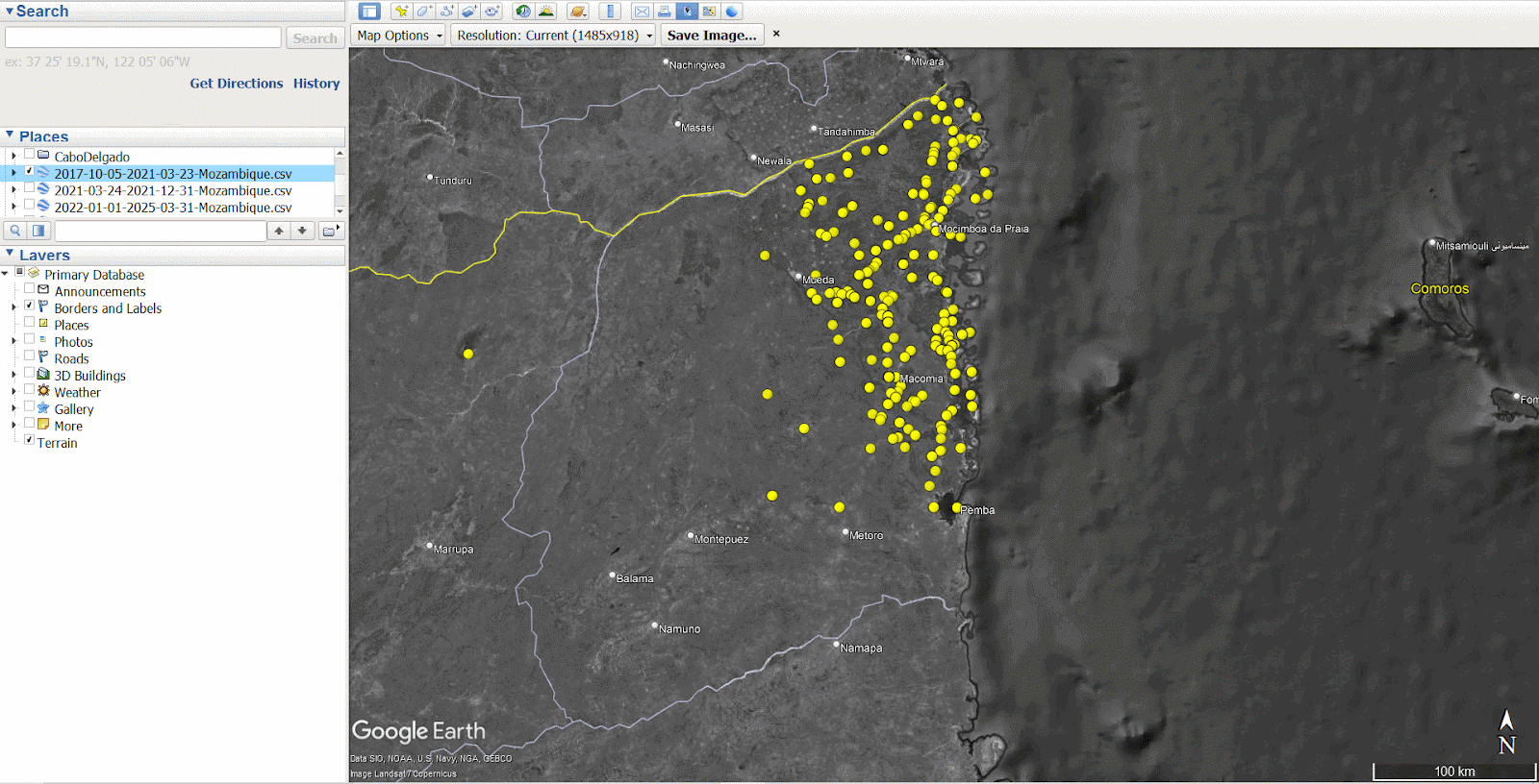
The visualisation reveals that during the first time period, Gradual Displacement (yellow), the violence was mostly concentrated in north-eastern Cabo Delgado, in and around Macomia, Mocimboa da Praia and Palma. In the second time period, Peak Displacement (red), incidents remained high in the north-east, leading to a large influx of IDPs into the Metuge region. By the third time period, Post-Peak (blue) the conflict had spread further south and west, increasing the risk of repeated displacements for populations already uprooted.
Zooming in on Displacement
To better understand localised displacement patterns, we can begin identifying specific IDP settlements of interest using high-resolution satellite imagery.
The Copernicus Emergency Mapping Service (EMS) conducted a satellite-based assessment of Cabo Delgado in 2021, identifying and mapping 27 IDP sites across the province.
The EMS’ mission, to deliver near-real-time maps and geospatial data during or immediately after a critical event, aims to help responders on the ground make informed decisions quickly. Recent activations have included the wildfires in Portugal, floods in Germany, or post-landslide in Ethiopia. You can access their full database here.
The EMS was activated over Cabo Delgado in response to the displacement of thousands of civilians after militants attacked and killed dozens in the coastal town of Palma. The map below shows seven of the IDP sites captured by the EMS in 2021 in the districts Metuge and Mecufi.
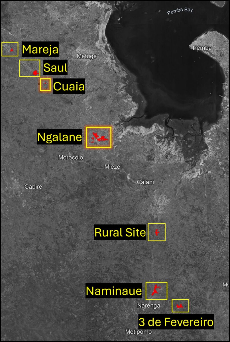
Based on the EMS data, we will focus on two out of the seven settlements: Cuaia (40°21’E 12°59’50″S) and Ngalane (40°23’50″E 13°2’46″S).
Copernicus EMS provides a detailed guide on what to look out for when analysing a potential IDP settlement, including housing types, tents, and other structures. Follow this link to download the PDF titled Technical Report.
Cuaia – A Temporary Settlement
As seen in the satellite imagery below, an organised camp including tents and sanitation facilities to the west of the small village of Cuaia was visible in May 2021. However, by May 2022, all the tents had disappeared, indicating that this was a temporary site which did not develop into a permanent IDP settlement.
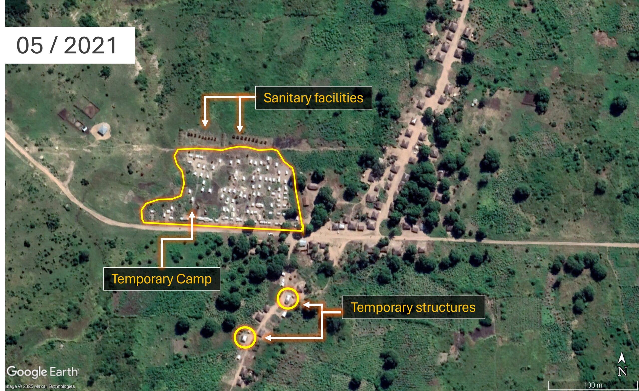
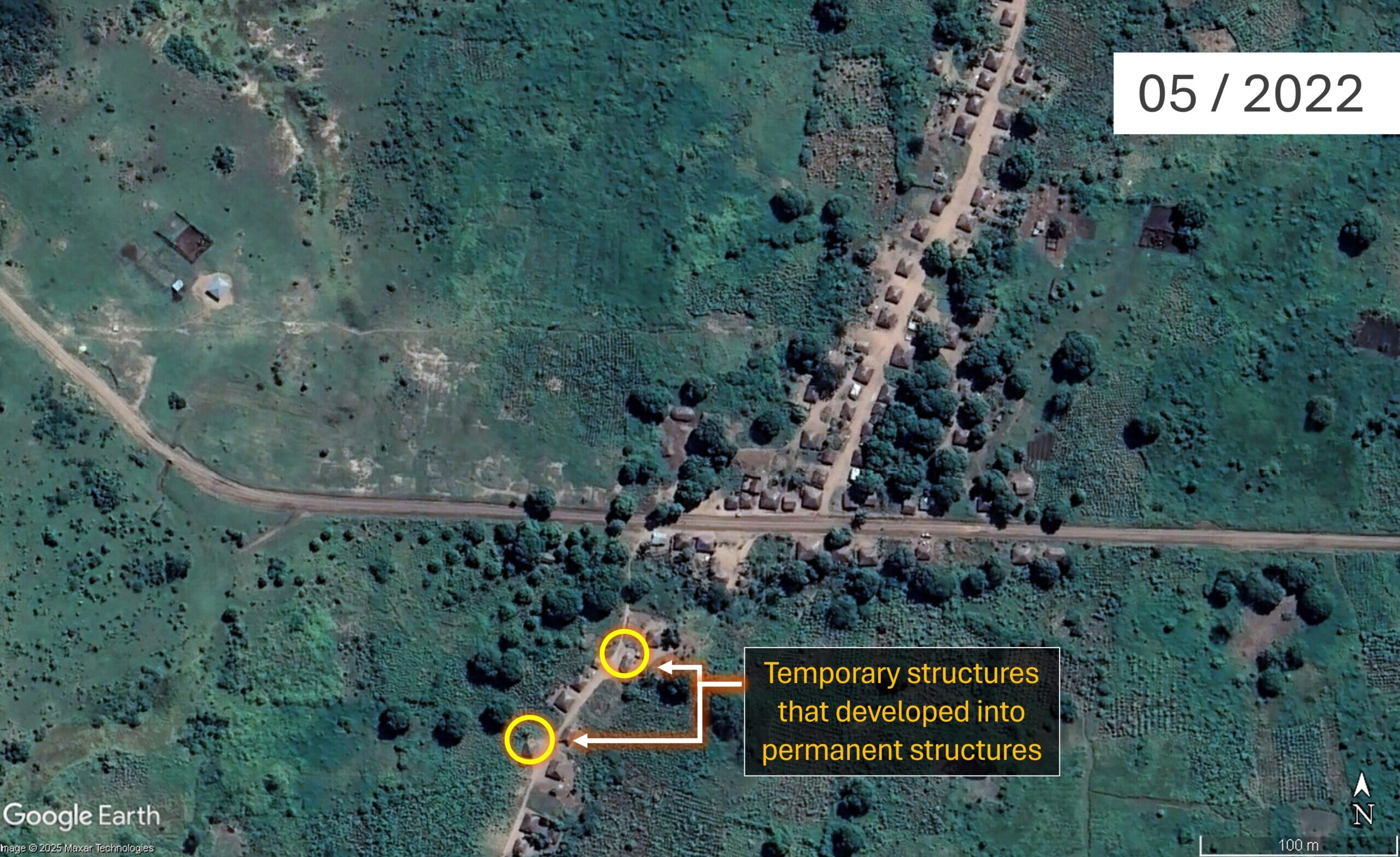
Imagery of Cuaia (40°21’E 12°59’50″S) in May 2021 and May 2022. Source: GoogleEarthPro 2025
The tents’ light-coloured roofs and their uniform size and shape indicate that this settlement was temporary. Their neat arrangement in closely spaced rows suggests the camp was established by a humanitarian organisation. Just north of the tents, two rows of small dark structures are also visible, most likely sanitary facilities. Their alignment to the camp further supports the interpretation that this is a planned, non-permanent installation, distinct from the adjacent village to the east. In the southern part of the image, two buildings have appeared. A change in the colour and material of their roofs can be observed between 2021 and 2022, suggesting a shift from a temporary to more durable construction.
Ngalane – A Permanent Settlement
Located south of the city of Metuge, Ngalane’s expansion is clearly visible in satellite imagery – from a small community in 2020 to a larger, more established site by 2021. The visible increase in housing and agricultural fields suggests that Ngalane has transitioned from a temporary site into a permanent IDP settlement.
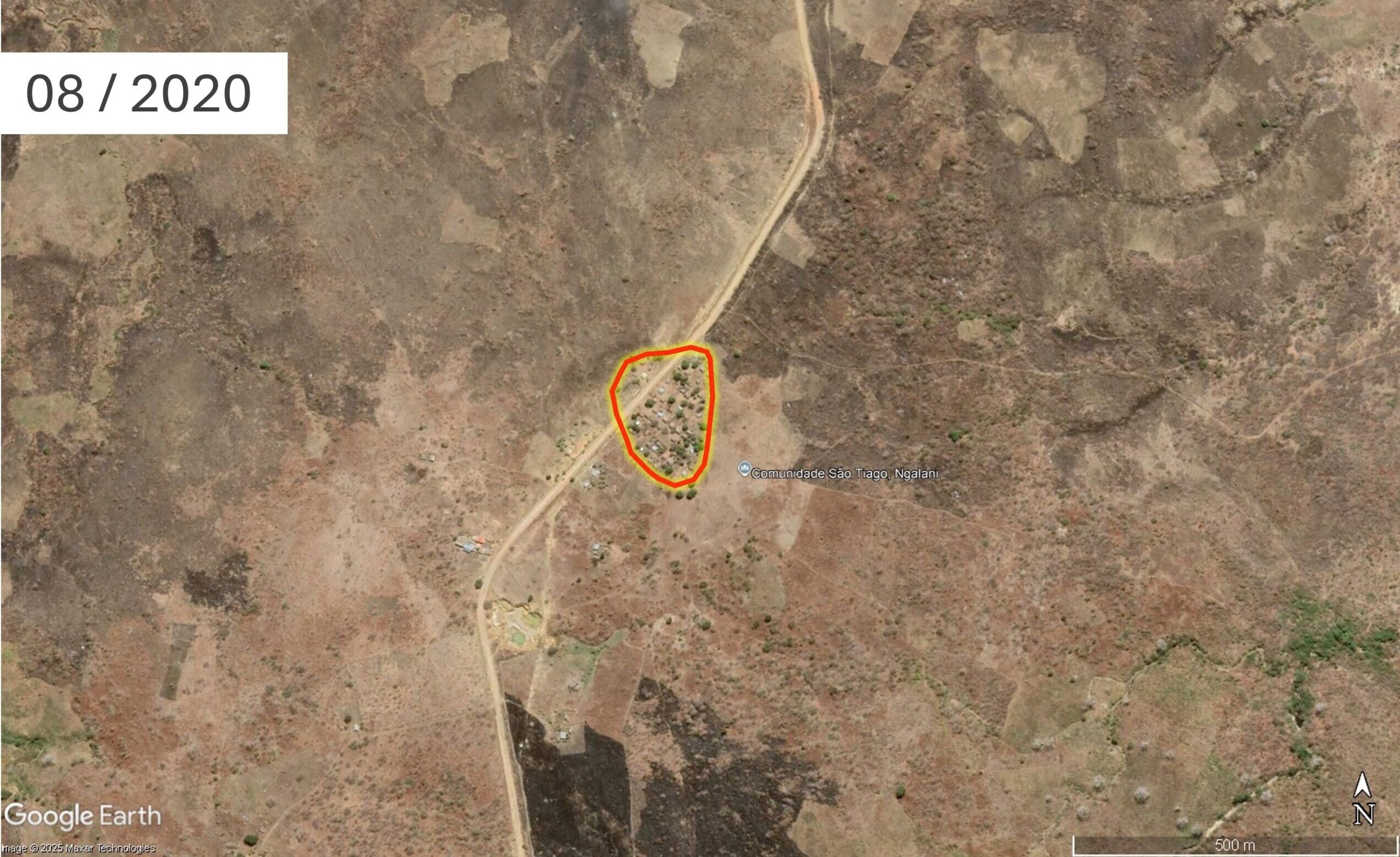
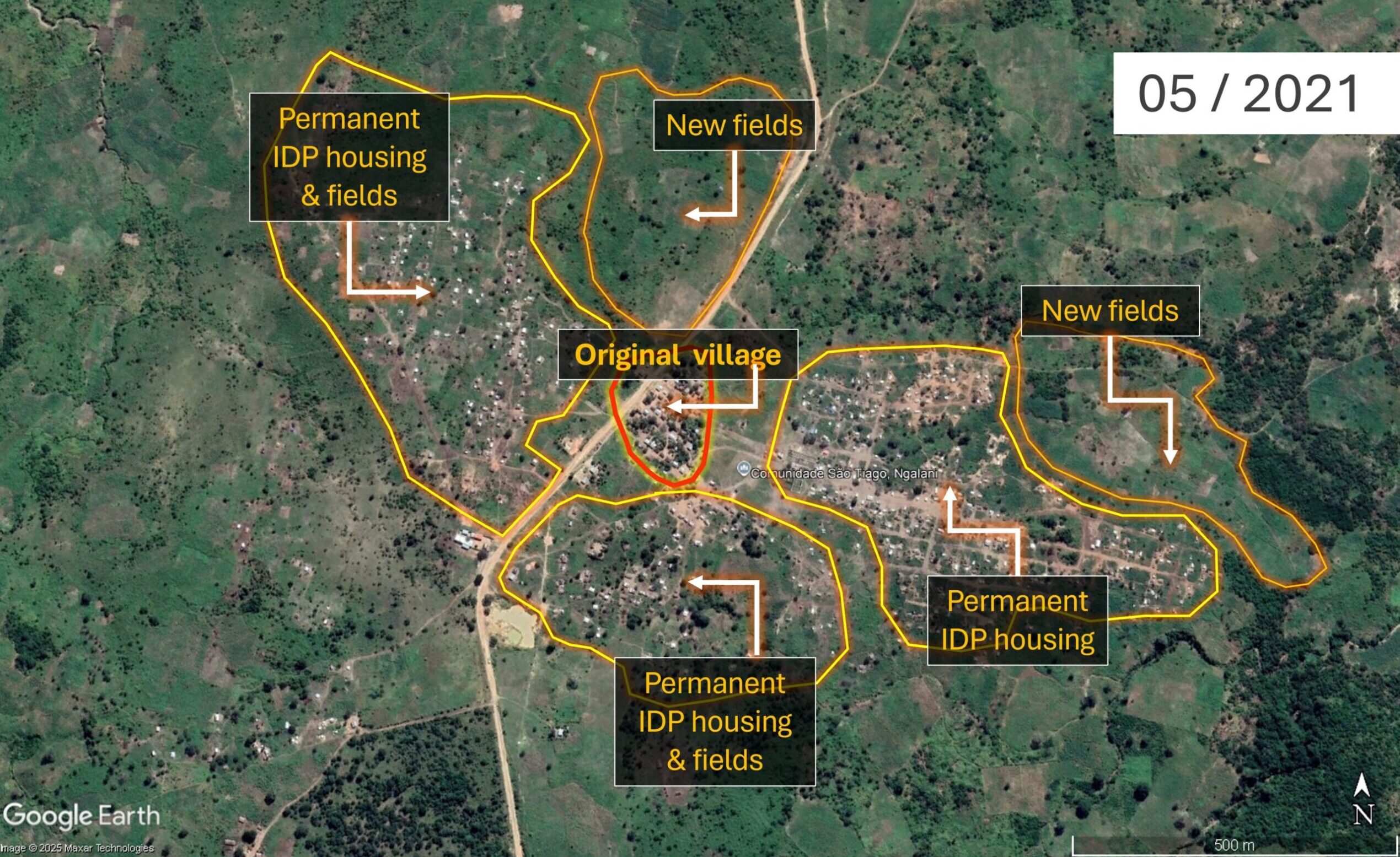
Imagery of Ngalane (40°23’50″E 13°2’46″S ) in August 2020 and May 2021
Rather than the organised, grid-like layout seen at temporary sites such as Cuaia above, the organic arrangement of dwellings in Ngalane, along with informal footpaths, small roads, and newly established small fields and cultivated plots, all indicate a level of permanence. While some buildings still have light-coloured roofs, indicating tent fabric, the overall spatial organisation of the settlement, combined with the presence of cultivated land, provides stronger evidence of a shift from short-term displacement to long-term settlement, reflecting efforts to rebuild livelihoods.
Analysing the Settlements’ Digital Footprints
Now that we’ve identified our two locations of interest, we can further analyse the settlements’ structures and their populations’ exposure to climate-related hazards, using building footprint data from OpenStreetMap (OSM). OSM is a collaborative project that provides free, crowdsourced geographic data, including information on roads, buildings, and other infrastructure.
A settlement’s footprint data is based on the number, size, and shape of individual buildings, and can be used to estimate how many people live in a given area. Such data can be leveraged for exposure mapping, helping to identify a location, its density, and the resilience of its structures in relation to climate-related hazards such as floods, droughts, or cyclones.
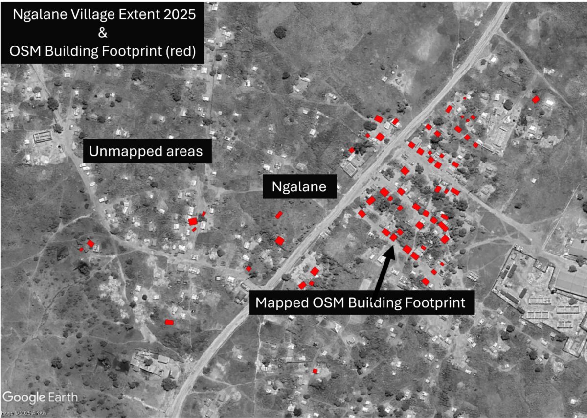
Ngalane – an Incomplete Footprint
To see the current OSM building footprint of Ngalane, you’ll first need to create a free account.
By navigating to the iD Editor window, we can see the OSM footprint of the original village (outlined in red), before the high influx of IDPs, has mostly been mapped. Red rectangles mark the buildings currently recorded in OSM.
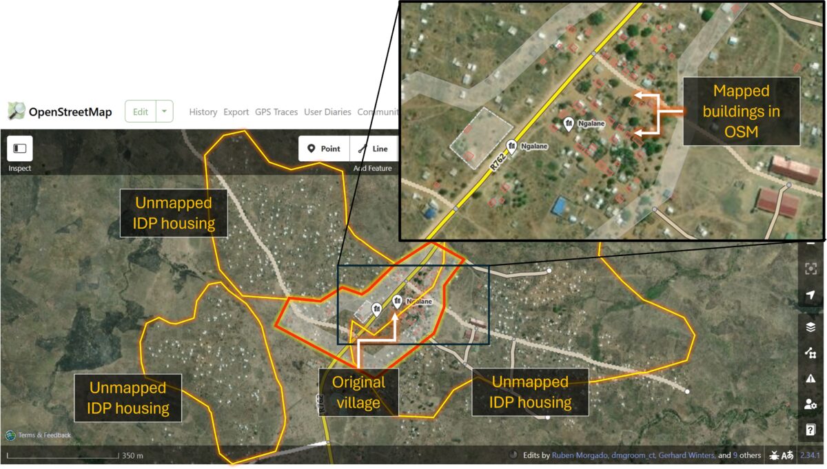
However, beyond the old village boundary, the newer settlements, home to the IDPs, remain entirely unmapped and therefore undocumented. In the event of a future storm or other climate-related hazard, the absence of mapping data for this community could result in their exclusion from impact assessments and early response planning.
Cuaia – an Out-of-Date Footprint
In Cuaia, 83 of the original village buildings have been mapped in OSM. None of the temporary structures have been documented, as they only briefly existed in 2021. However, when comparing the OSM data with more recent satellite imagery from 2025, it’s clear the settlement’s footprint is out of date: some buildings no longer exist, while others remain unmapped.
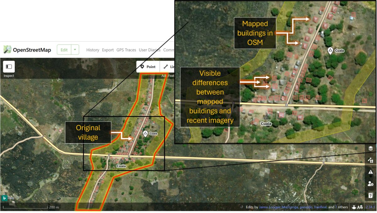
The OSM metadata reveals that most structures were mapped between 2017 and 2019. If the data were needed for an accurate exposure assessment in the event of a cyclone or flood, for example, the OSM building footprints would need to be rapidly updated.
To address such time-sensitive scenarios, the initiative Humanitarian OpenStreetMap Team (HOT) organises rapid-response open mapping for crisis-affected areas. HOT is a global initiative that mobilises volunteers to help produce real-time geospatial information by tracing buildings, roads and rivers in OSM. Its Export Tool also allows users to select an area of interest and download custom extracts of OSM data, including building footprints, road networks, or land use, in various formats for geospatial analysis.
Analysing OSM data in Google Earth Pro
To overlay the settlement’s building footprints with the conflict and climate data, we will first export the relevant OSM layers using the HOT Export Tool, then import them into Google Earth Pro for analysis.
You will need to create a free HOT account before taking the next steps.
Step 1: Open the HOT Export Tool. Create a name for your dataset, then navigate to your area of interest, for example, Ngalane. Using the toolbar on the right, select the box tool and click and drag a rectangle over the area you want to export the data for.
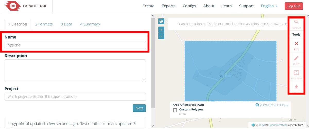
Step 2: Under the Formats tab select Google Earth .kml then click Next.
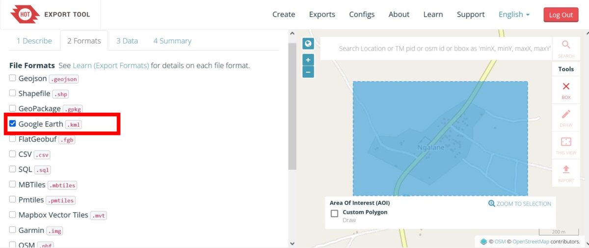
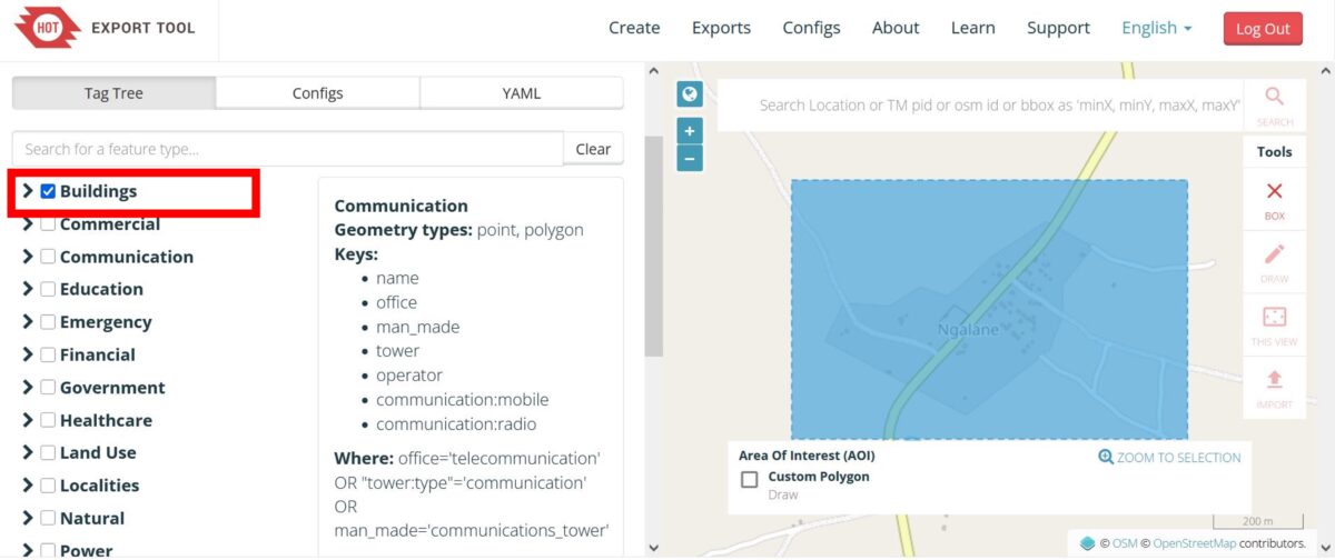
Step 3: Tick the Buildings box to export all building footprint data for your selected area. Click Next.
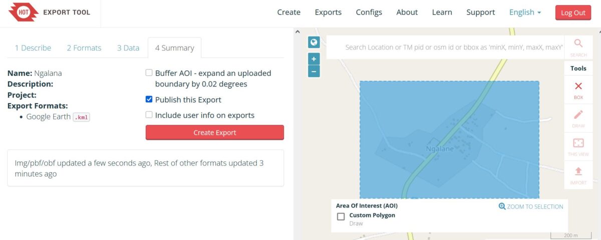
Step 4: Click Create Export.
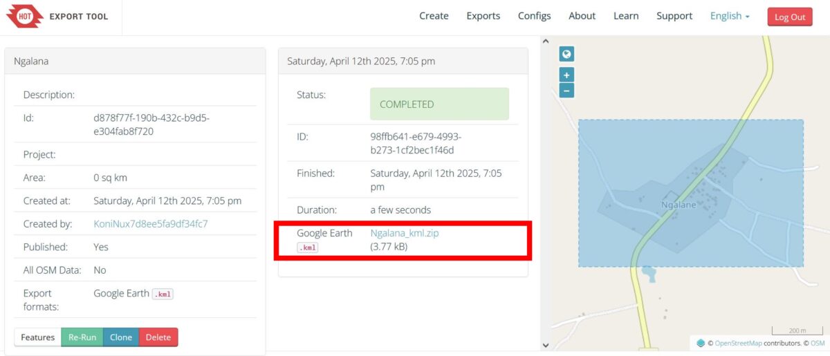
Step 5: Once the status shows Completed, click on the download link to save the data as a .zip file.
Step 6: To import the data into Google EarthPro, either drag and drop the .kml file directly into the program or go to File -> Import -> then select the downloaded file. Once the data is imported, right-click on the layer in the panel on the left, select Properties, and under the Style, Color tab, customise the appearance of the building data on your map.
By visually comparing the distribution of mapped buildings to the satellite imagery in Google Earth Pro, you can assess the completeness and accuracy of OSM mapping in your area of interest. You can also explore historic satellite imagery through the Time-Tool to track changes in the building footprint over time and better understand how the settlement has developed.
Overlaying the Climate Data
In Part I of this guide, we mapped NASA climate data, specifically the accumulated rainfall brought by Cyclone Kenneth in 2019, to highlight the cyclone’s path and its impact on communities in Cabo Delgado. For a refresher on how to import climate data into Google Earth Pro, see Part I of this guide.
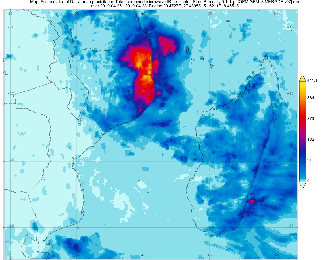
By overlaying the ACLED conflict incident data (2017 to 2021) with the accumulated rainfall data in Google Earth Pro, we can see how violence concentrated in the northwest was a major driver of displacement both before and during Cyclone Kenneth. However, displacement southward brought many directly into areas exposed to severe flooding.
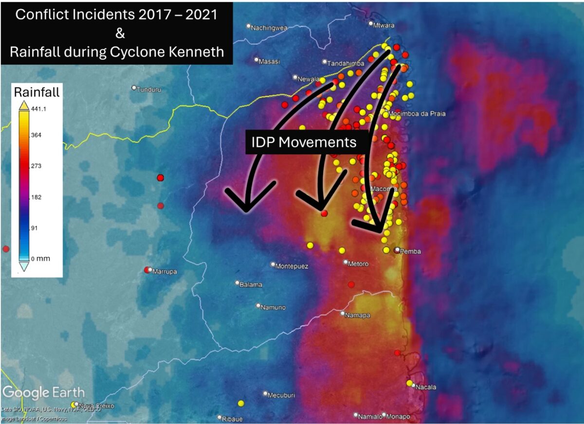
Source: ACLED 2025, NASA 2025, Google Earth Pro 2025
Zooming in on our case study settlement, Ngalane, further reveals this community’s high exposure to the impacts of Cyclone Kenneth, including heavy rainfall and flooding.
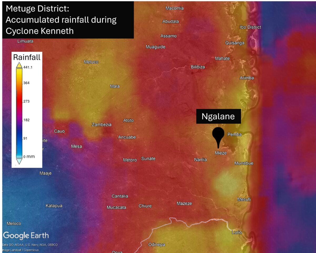
With at least 63 homes visible in Ngalane’s OSM building footprint, we can estimate a minimum number of residents at the time Cyclone Kenneth struck. However, since the footprint was incomplete, the actual population was likely higher.

Mapping Cabo Delgado in 2025
To date, numerous communities across Cabo Delgado remain unmapped and highly vulnerable to the next cyclone or flood, including Ngalane.
Since the beginning of this year, more than 20,000 people have reportedly been displaced by ongoing violence, and these communities must be resettling somewhere.
Recent satellite imagery of Ngalane reveals the rapid expansion of new buildings in all directions from the original village – all undocumented and therefore invisible on existing maps.
In order to update essential mapping data of the community, together with HOT we have created a task in the HOT OSM Tasking Manager to initiate mapping of new buildings in Ngalane. Follow this link to create an account, complete the OSM mapping tutorial and start mapping buildings in Ngalane! Your efforts will help generate essential mapping data for this settlement, supporting preparedness for future storms in the region.
To find out more about the intersection of climate, conflict, and displacement, explore the Story Map Climate, disasters and conflict in Cabo Delgado by the Red Cross Red Crescent Climate Centre (2022). It offers a retrospective analysis of the impacts of Cyclones Kenneth and Idai, framed within the context of conflict and displacement.
Bellingcat is a non-profit and the ability to carry out our work is dependent on the kind support of individual donors. If you would like to support our work, you can do so here. You can also subscribe to our Patreon channel here. Subscribe to our Newsletter and follow us on Bluesky here and Mastodon here.