Dark Web OSINT With Python Part Three: Visualization
This article was originally published on the AutomatingOSINT.com blog.
Welcome back! In this series of blog posts we are wrapping the awesome OnionScan tool and then analyzing the data that falls out of it. If you haven’t read parts one and two in this series then you should go do that first. In this post we are going to analyze our data in a new light by visualizing how hidden services are linked together as well as how hidden services are linked to clearnet sites.
One of the awesome things that OnionScan does is look for links between hidden services and clearnet sites and makes these links available to us in the JSON output. Additionally it looks for IP address leaks or references to IP addresses that could be used for deanonymization.
We are going to extract these connections and create visualizations that will assist us in looking at interesting connections, popular hidden services with a high number of links and along the way learn some Python and how to use Gephi, a visualization tool. Let’s get started!
NetworkX and Gephi
If you read one of my earlier posts on solving the game Her Story using Python, you might already have the NetworkX library installed as well as Gephi. If not you can install NetworkX like so:
Mac OSX / Linux: sudo pip install networkx
Windows: pip install networkx
If you have never used pip before or don’t know what it is, take my Python course and find out.
Gephi can be downloaded from here.
NetworkX is the Python library that we are going to use to create entities on a graph (nodes) and then allow us to connect them together (edges). Once we have constructed this graph we will save it to the GEXF file format that Gephi can then open. We then use Gephi to layout the graph and begin exploring the data.
Now that you have the prerequisites installed, let’s start writing some code to analyze the data.
Coding It Up
The Python part is actually pretty quick and easy. We are just going to walk through each of the JSON files, examine the data, and then check a handful of fields that can include linked data. From there we simply add that data (nodes) to the NetworkX graph and connect them together (edges).
At this point if you read the second post, you are probably thinking that you could do the same with SSH keys, server headers, or other information that might indicated shared infrastructure. As homework feel free to take our graphing technique and go back and apply it to SSH keys, the results are pretty neat!
Crack open a new Python file, name it hidden_services_graph.py and start pounding out the following code (you can download the source here):
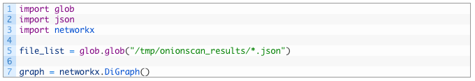
- Lines 1-5: we import all of our modules and then get the list of files (5) using the glob module as previously discussed in part two of this series.
- Line 7: here we initialize our graph object so that we can begin adding nodes and edges to it as we discover links between hidden services, clearnet sites and IP addresses.
Now let’s iterate over each of our JSON files and start extracting the relationships that were discovered by OnionScan:
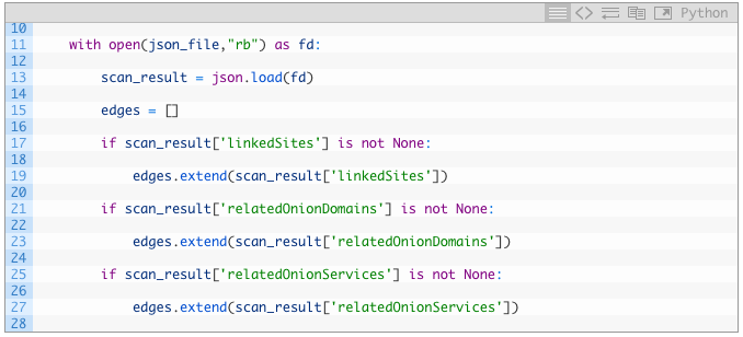
- Line 15: we are creating an empty list to hold the edges (connections) that we find in the JSON results.
- Lines 17-19: we test to see if the hidden service has any linkedSites (17) and if it does we grab all of them and push them into our edges list using the extend function.
- Lines 21-27: we repeat the same process as our previous chunk but testing for the relatedOnionDomains and relatedOnionServices members of the JSON.
Now we are going to loop over the various linked hidden services and clearnet sites and get them added to our graph. Let’s implement this code now:
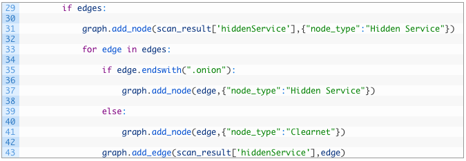
- Lines 29-31: we test to see if there are any edges (connections) to the current hidden service (29) and if so we add the current hidden service to the graph object using the add_node function. The first parameter of the function is the name (label) of the node, and the second parameter we are passing in a dictionary. This dictionary is a set of node attributes. In this case we create an attribute called “node_type” and we set it to “Hidden Service”. You can create as many node attributes as you like and name them whatever you want (instead of “node_type”). What this allows us to do later is to color the graph in Gephi to have all “Hidden Services” be one color, clearnet sites another color and IP addresses as separate color.
- Lines 33-41: we start walking over each edge (33) and first test if the current edge ends with “.onion” (35) which indicates a hidden service. If it is a hidden service, we add it to the graph (37) again setting the node_type attribute to “Hidden Service”.
- Lines 39-41: if the edge does not end with “.onion” (39) then we assume it is a clearnet site and so we add a new node to the graph object (41) and set it’s node_type attribute to “Clearnet”.
- Line 43: we now complete the connection between our current hidden service and the edge we were just processing by using the add_edge function. This function takes two parameters, the source and then destination node in the graph to create the connection. The source will always be the current hidden service we are processing.
Beautiful, we are almost done! Next we are going to handle any IP addresses that were detected by OnionScan when scanning the current hidden service we are processing from the list. We will add some specific code to handle them and then we will output the graph to a file so we can open it in Gephi.
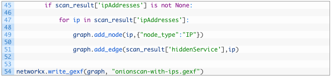
- Lines 45-47: we test to see if there are any values in the ipAddresses field (45) from our scan result, and if so we start to iterate over the list of IP addresses (47).
- Lines 49-51: we add the IP address as a node in our graph and set it’s node_type attribute to “IP” (49) and then create an edge between the current hidden service and the IP address (51).
- Line 54: our final move in this script is to output the graph to a GEXF file using the write_gexf function which takes our graph object and a filepath as parameters.
Nice! If you run the script and all goes well, you should see a file appear in the same directory as your Python script called onionscan-with-ips.gexf which you can now load into Gephi for analysis. I have provided my GEXF file here.
Creating a Gephi Visualization
Now let’s do a step by step on how to get a graph laid out in Gephi, and how to start to make a bit of sense out of it. In Gephi go to the File menu and select Open and then locate your onionscan-with-ips.gexf file.
When you first open the graph Gephi will show you some information about the graph:

Click OK to continue loading the graph which will present a big gnarly mess. This is always the starting point for a new graph.


Depending on how much horsepower your computer has this can take a minute, or two, or thirty. Eventually you will start to see something that looks like the following:

You can now click the Stop button to stop the graph from continuing to run the layout algorithm. Next we are going to partition the graph, which is a fancy way of saying that we are going to apply pretty colors to it.
In the top left of your Gephi screen is the Appearance panel. Make sure Nodes is selected and then click the little palette icon (1). Now click the Attributes selection and from the drop down select node_type (2). This is the node_type attribute that we applied in our Python code, and Gephi will apply a unique color to each unique node_type that it discovers. Now click the Apply button (3) and you should have a graph that is colored.

Awesome, so this can help you to visually see clusters of interesting pieces of data or to investigate connections. For example look for a connection on your graph that looks like this (graph is zoomed in and rotated):

If we zoom in a bit we see that there is a single IP address that is connected between two hidden services. This immediately looks interesting to me.

Now we need to turn on the labels for the nodes so that we know what the IP address is and what the hidden services are. In the bottom right of the graph click the little arrow (1) to expand the bottom propery panel. Then click on the Labels selection (2) and check off the Nodes box (3). You will see all of the nodes get labelled with gigantic labels, so use the slider (4) to scale the labels down. Zoom in the graph to inspect what the IP address is and the hidden services connected to it.

Once the labels are turned on we can zoom in on the graph and have a look at what the IP address is and the two hidden services. Note that the hidden services listed at this time didn’t have any illicit material on them, but visit them at your own risk!

While this is only touching on about 1% of Gephi’s capabilities, just by cruising around the graph and examining interesting clusters or connections can yield interesting intelligence.
Now we can do a bit more with the visualization to help us figure out the most popular nodes in this network. We can do this by setting the size of the node based on the number of connections that it has. In the top left hand panel (where you set the color) you can click the little rings (1) and then select the Attributes option. From the dropdown select Degrees (2) and then in the two text boxes enter 20 for the minimum size and 400 as the maximum size (3). Click the Apply button.

When you click Apply you’ll see some gigantic nodes appear, which indicates that they are the most well connected nodes in the graph. The more connections, the bigger the node.

The problem at this point is that there is a lot of noise still. You can click and grab those large nodes and pull them out of the mess or you can zoom in on the graph to read the labels on those nodes.
A better alternative is to use some of the filtering functions in Gephi to remove all the little nodes in the graph so we can easily see only the most well connected nodes. On the right hand side of the screen is the Filters panel. Expand the Topology filter (1) and then click and drag it to the Queries panel below it (2). You will now be presented with a slider where you can set the minimum and maximum number of connections (degrees) to nodes you will to show on the graph. Try moving the minimum slider to the right (3) and then click the Filter button (4).


So there you have it! The ability to take your OnionScan data and visualize the connections between hidden services, clearnet sites and IP addresses. Gephi is an incredibly powerful tool with a pile of features, and we only touched on a handful of them but you will find that even these techniques we have used are incredibly useful.
For homework, try and visualize connections between SSH keys using the previous post as an example. Try playing around with the filtering system as well to see what other things you can show and hide in the graph. There will be one more blog post in this series and then I will move on to other topics.