COVID-19: Monitoring The Global Slowdown
Since the first cases of the novel coronavirus (COVID-19) were reported in China’s city of Wuhan in December 2019, the virus has spread throughout the world and — as of the writing of this article — infected over 1.5 million people, killing at least 94,000 of them. In a March 16 press conference, the Director General of the World Health Organization called the COVID-19 pandemic “the defining global health crisis of our time.”
As the first country affected by the outbreak, China was also the first to implement the social distancing measures that have since become part of everyday life for an increasing percentage of the world’s population. While these measures vary in severity, enforcement, and compliance depending on the region, they have all led to a marked decrease in outdoor human activities. From air travel to outdoor markets, the COVID-19 pandemic has reduced how far, how often, and where we travel.
Some of this reduction in human activity can be observed and measured using open source tools. Previously, we outlined some of the open source tools that you can use to investigate COVID-19 dis/misinformation. In this article, we will use some of these same open source tools to explore how the pandemic has ground much of the world to a halt. Even from the confines of your home, you can freely explore what the world looks like now. Take a moment to look around and observe the global slowdown (what else do you have to do anyway?).
Air Travel
The airline industry is among the hardest hit by the global slowdown precipitated by the COVID-19 pandemic, with the CEO of American Airlines saying its effects on the industry are “worse than 9/11”. Open source flight tracking data can help us quantify the virus’ effects on air travel, and visualize the impact that it has had on the movements of people and goods across the world.
Both Flightradar24 and Radarbox24 make the number of aircraft that they track in a given time period available. Ordinarily, we use these websites to track the movements of people across the globe. In this case, we will use them to track the opposite: how people are not moving during the pandemic.
Flightradar24’s statistics page shows the number of flights that the website tracked per day over the last 90 days. Its seven-day moving average (that is, the average number of flights tracked per day over a seven-day period) fluctuated from a low of 159,605 flights on December 30, 2019, to a high of 179,282 on January 10, 2020. The most recent peak occurred on March 9, when the figure reached 178,786 flights.
On March 24, 2020, the seven-day moving average reached 116,730:
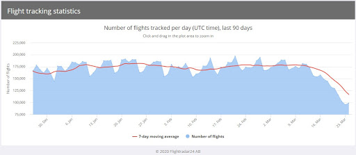
Total number of flights (blue) and seven-day moving average (red) showing tracked flights from the end of December 2019 to late March 2020 (Source: FlightRadar24)
Radarbox24’s flight statistics are divided into three categories: commercial flights, major airports, and major airlines. The commercial flights category shows the number of commercial flights tracked by the website on a given day. This data shows a precipitous drop in the number of daily flights since COVID-19 began to affect a greater proportion of the world population. For example, the website tracked 101,028 commercial flights on February 20, 2020: on March 23, it tracked just 49,238 flights:
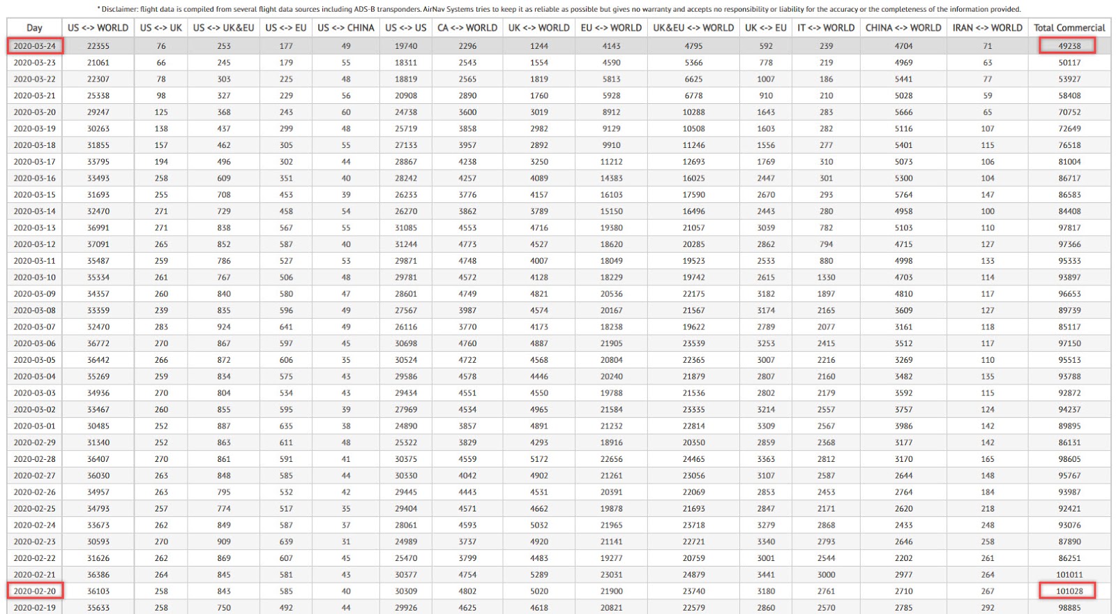
The number of commercial flights tracked by Radarbox24 between February 20, 2020, and March 23, 2020 (Source: Radarbox24)
These same open source tools also allow for the visualization of these raw numbers. For example, Flightradar24’s historical feature allows users to view any section of airspace in the world at a given point in the past.
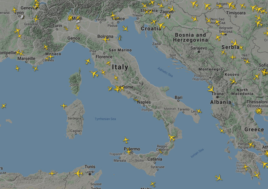
The slider below shows airspace over Italy on two dates: January 31, 2020 when the first case of COVID-19 was reported in the country, and March 24, 2020, approximately two weeks after the country entered into lockdown:
The snapshots were each taken at approximately noon Rome time on the two respective dates (Source: Flightradar24) 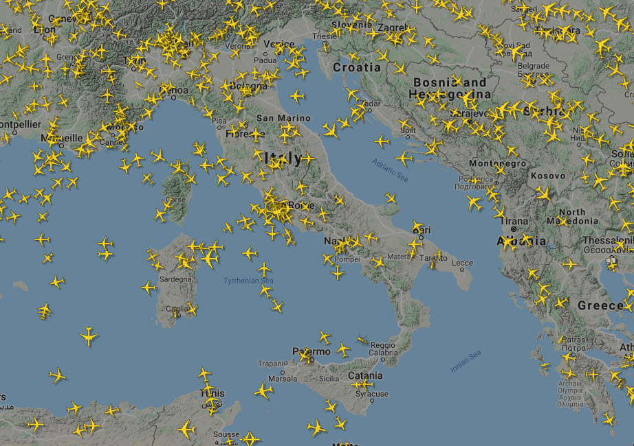
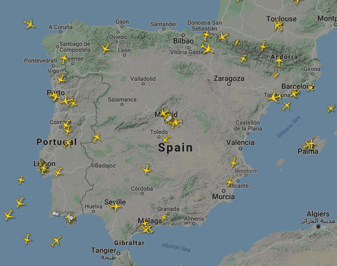
Below, we see the airspace over the Iberian peninsula on the day that Spain reported its first case of the virus (January 31, 2020), and on March 24, 2020:
The snapshots were each taken at approximately noon local time on the two respective dates. (Source: Flightradar24)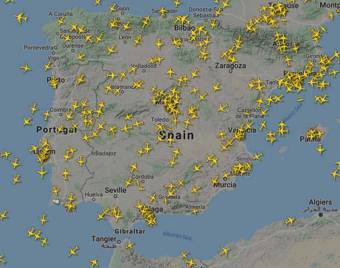
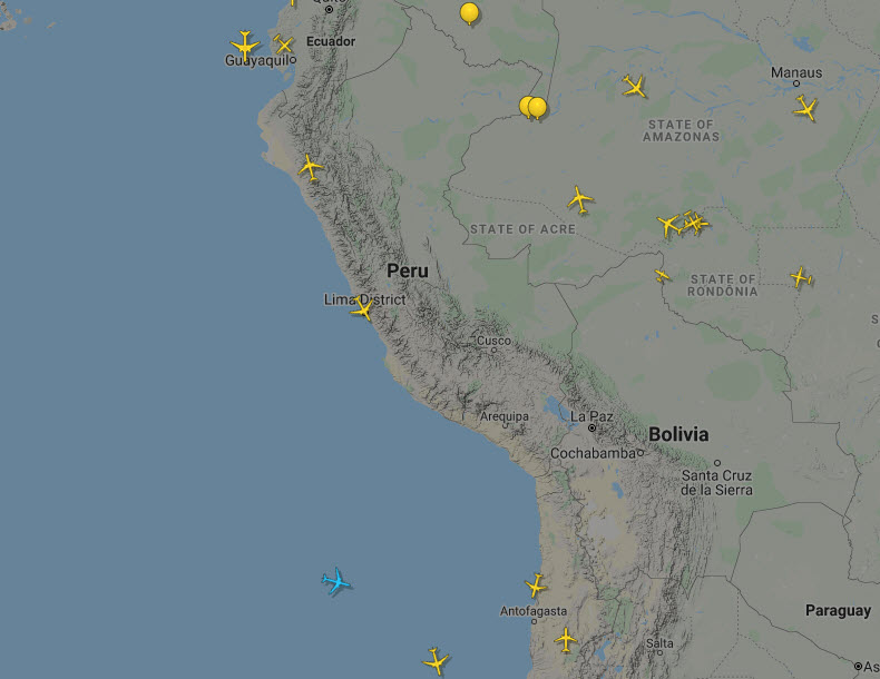
European skies are not the only ones cleared by COVID-19. The slider below shows the airspace over Peru on the day that the country reported its first case of the virus (March 6, 2020), and on March 24, 2020:
The snapshots were each taken at approximately noon local on the two respective dates (Source: Flightradar24)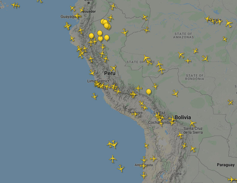
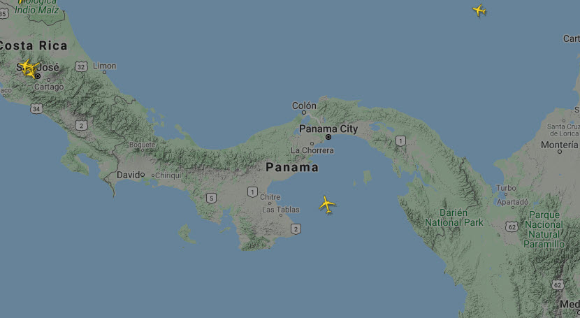
Panama’s Tocumen International Airport is a transit hub in the region. The slider below shows air traffic over Panama on the day that the country reported its first fatality from COVID-19, March 10, and on March 24, 2020:
The snapshots were each taken at approximately noon local time. (Source: Flightradar24)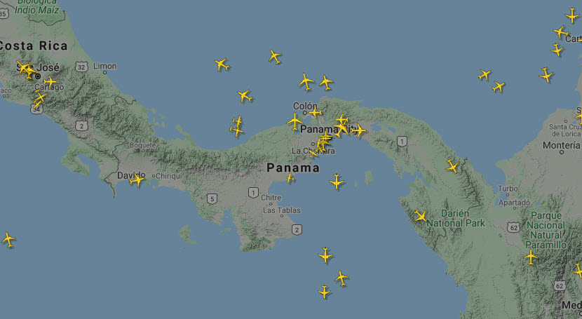
You can also play with the data yourself by downloading it as a CSV file and using your preferred programming method to organize and visualize it. We did this ourselves with the data in order to plot the change in the number of flights, depending on how many confirmed cases of the virus were in each area. Here is our result:
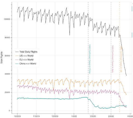
As you can see in the graph, it was only after there were over 1,000 confirmed cases of COVID-19 in each region that the flights to and from started to significantly decrease. Overall, the total number of flights in the world only experienced a really sharp decline once the United States had over 1,000 confirmed cases. Of course, this does not imply causation as this also coincides with the time that much of the world began to take the virus seriously and governments were closing down borders daily.
If you would like to track the skies from home, make sure to check out our Beginner’s Flight Tracking Guide.
Flight data paints a picture of what is going on in the sky above and how much global movement is slowing down. However, it is also interesting to take a look at what is happening on the ground, and observe how once crowded places look eerily empty today.
Live Webcams
Cameras connected to the internet, such as webcams or security cameras, are known as IP cameras. These can (and should) be password protected in order to stop people from accessing the imagery being captured. However, many are not secured and are thus accessible to people who know how to find them. Thankfully, most of these unsecured cameras do not show the inside of people’s private homes. Instead, these are usually cameras used to surveil public places, such as parking lots, parks, or a city square.
You can try to find open IP cameras yourself using a Google search operator. To do so, simply search a database of Google operators for “webcam” and try using some of the search suggestions that come up.
However, there are websites that have already accumulated some of the more interesting open IP cameras around the world for you to view. These tend to show popular tourist attractions, big city squares, and famous beaches. There are also sites that collect webcam imagery at random but can have some interesting results, such as traffic cams showing busy highways in big cities. Some sites to check out are insecam.org/en/ and skylinewebcams.com/.
We conducted a search of major sites, trying to find live cameras on popular tourist attractions that are usually crowded with people on any given day. We wanted to see what they look like now that residents are being told by their governments to avoid travel and mingling in public spaces. Here is what we saw:

Source: https://www.skylinewebcams.com/en/webcam/italia/lazio/roma/fontana-di-trevi.html
This is a live capture of the Trevi Fountain in Rome on March 27 at 11:26 CET. As we can see, there are no tourists or locals walking around the famous fountain. Rather, there are police officers guarding and walking around it, in order to ensure that it remains as empty as it is.

Source: https://www.skylinewebcams.com/en/webcam/espana/comunidad-de-madrid/madrid/puerta-del-sol.html
This is a live capture of the Puerta Del Sol in Madrid, Spain on March 27 at 11:47 CET. We can see a couple people walking in the streets, but it remains mostly empty. There are also police officers guarding the area, making sure people are not congregating or socializing here.
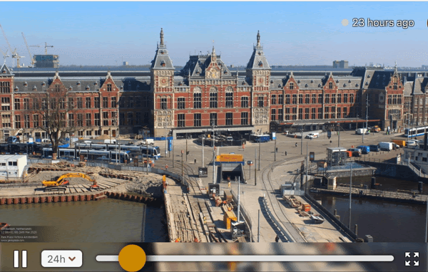
Source: https://www.windy.com/nl/-Webcams/Nederland/Noord-Holland/Amsterdam/Park-Plaza-Victoria/webcams/1511351235?52.269,4.474,9
This is a timelapse showing Amsterdam Centraal Station from noon CET on March 26 to noon on March 27. We can see that it has maintained almost complete emptiness for the last 24 hours. This is interesting because it shows that even local transportation has really slowed down. While the examples above are mostly showing tourist attractions and big gathering spaces, this is an essential part of the city, part of the daily lives of many Amsterdam residents. We can observe through the emptiness here that people do seem to be staying inside, or at the very least, are avoiding using the train system.
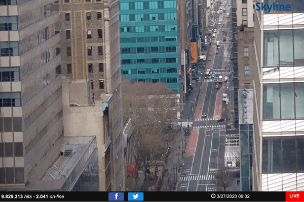
Source: https://www.skylinewebcams.com/en/webcam/united-states/new-york/new-york/nyc-42th-street.html
This is a live capture of 42nd St. in New York City at 9:02 AM EST March 27. You can see parts of Times Square at the top of the frame in the beginning of the capture. It is relatively very empty, but we do see movement here as people still walk outside and cars still drive by. New York is notoriously one of the busiest cities in the United States and, indeed, the world. For those that know it, this image, even without total emptiness, is unusual for a normal rush hour on a weekday. As governors throughout the United States start to take the risks of the virus more seriously, we will likely see more slow down in major American cities.

Source: https://www.skylinewebcams.com/en/webcam/israel/jerusalem-district/jerusalem/western-wall.html
This is a live capture of the Western Wall in Jerusalem on March 27 at 16:20 IST. As we can see, the Western Wall is practically empty, with only a few people walking around. As of publication, Israel had over 8,600 cases of the virus. Much mainstream media focus has been on how the virus is affecting Europe and the United States, but the Middle East, particularly Iran, has been hit strongly by its spread and effects.
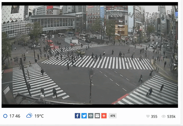
Source: https://worldcams.tv/japan/tokyo/shibuya-crossing
This is a live capture of Shibuya crossing in Tokyo, Japan on April 8 at 17:46 JST. Unlike what we saw in the other captures, this seems to indicate that there are still some people out in the streets of Tokyo, mingling in each other’s personal space. However, those that know Shibuya crossing will attest that there are very few people for this normally overwhelmingly crowded intersection. At this point, Japan has 3,906 cases and has officially declared a state of emergency.
Google Data
For many locations, Google Maps offers a “Popular Times” chart that sometimes includes live visit data. According to Google, live visit data is “updated in real time” using data from devices with Google Location History turned on, and compared with how busy a given location is on average at a given time. This feature allows users to estimate how busy a location might be at the moment, versus how busy it normally is.
Since many jurisdictions around the world are currently implementing some kind of “stay-at-home” measure, you can use this feature to monitor activity at locations in your city to determine how strictly residents are adhering to these measures.
For example, these are the live visit data graphs for four popular locations in Toronto, Canada. The screenshots were captured shortly before 9:00 AM local time on March 16, the first Monday after the provincial authorities announced the closure of all publicly funded schools for three weeks. At the time, this announcement was the most severe measure taken to combat the spread of the virus in Toronto.
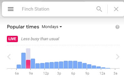
The Finch Station is a major transit hub for commuters traveling to downtown Toronto from the cities to its north (Source: Google)
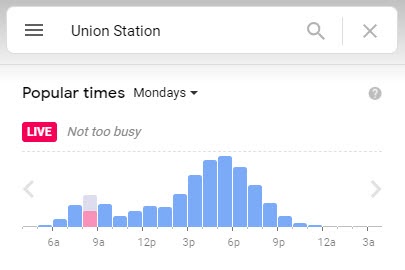
Toronto’s central transit hub, Union Station is normally packed during rush hours with people arriving on commuter trains from all around the area (Source: Google)
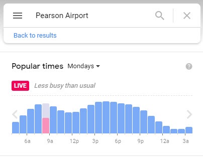
Toronto’s Pearson International Airport was also experiencing a significant reduction in visitor traffic according to Google’s live data (Source: Google)
On April 2, Google launched the Community Mobility Reports page. This page contains country-level reports that draw from the company’s user data to illustrate change in visits to places like grocery stores and parks. The purpose of these reports is to allow users to explore how movement in their communities has been affected by the COVID-19 pandemic.
The following figures show the decrease in mobility at several kinds of locations in Venezuela. This drop in activity corresponds to the March 16 declaration of national quarantine:
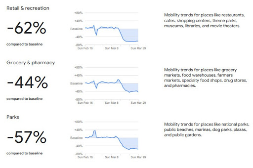
The decrease in mobility trends across these three location types corresponds with the declaration of a national quarantine on March 16 (Source: Google)
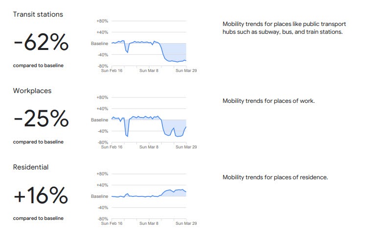
Note that mobility trends in residences are up, reflective of people’s adherence to the quarantine measure (Source: Google)
Satellite Imagery
Another data source to keep an eye on in the coming weeks will be satellite imagery. While there are companies that provide high-resolution, up-to-date satellite imagery from virtually every spot on the planet for a fee, free options are limited in both frequency of imagery and resolution. These options can provide visual evidence of the global slowdown caused by the COVID-19 pandemic.
The Sentinel Hub Playground offers near-daily imagery at a resolution high enough to show the placement or absence of large objects in a given location, for example, parked aircraft.
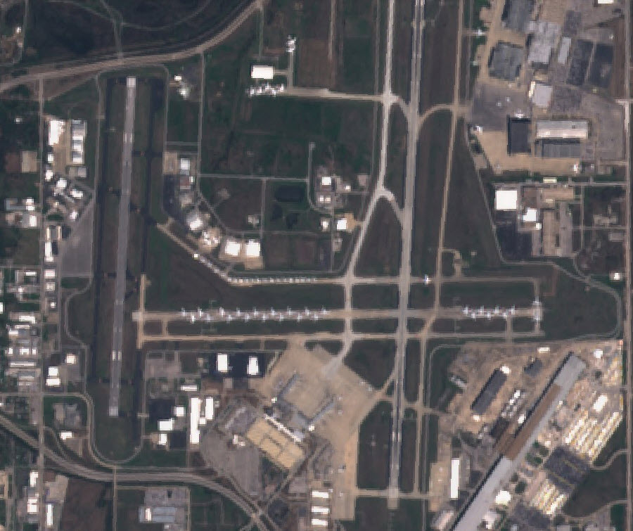
Since the outbreak of the virus has resulted in a dramatic decrease in air travel as outlined in the section above, some airlines have been forced to park their aircraft in airports. Runways that would normally be clear for arriving and departing aircraft have today become parking lots for unused airliners.
We can use the information in this article listing some of the airports that are currently being used to park aircraft to check those locations on satellite imagery services. Because the Sentinel Hub Playground platform offers historical imagery, we can go back in time and check how these airports looked like in the past, and how they look like now.
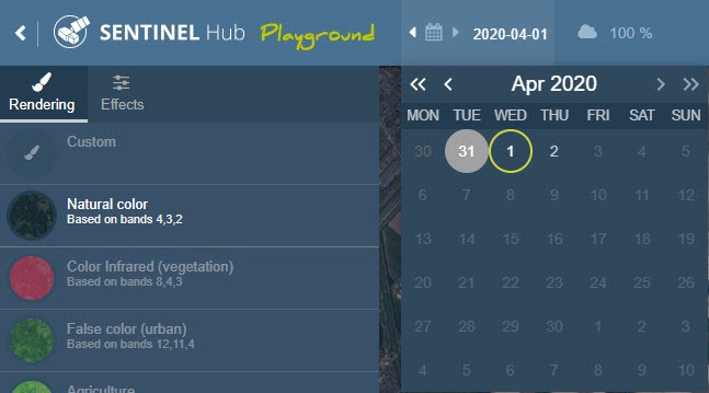
Clicking on the date on the top left of the Sentinel Hub Playground page will open a calendar, which allows the user to select the dates(s) from which they want to see imagery (Source: Sentinel Hub Playground)
A runway at the Tulsa International Airport on January 1 2020 and March 25 2020. The runway now serves as a parking lot for over two dozen aircraft (Source: Sentinel Hub Playground)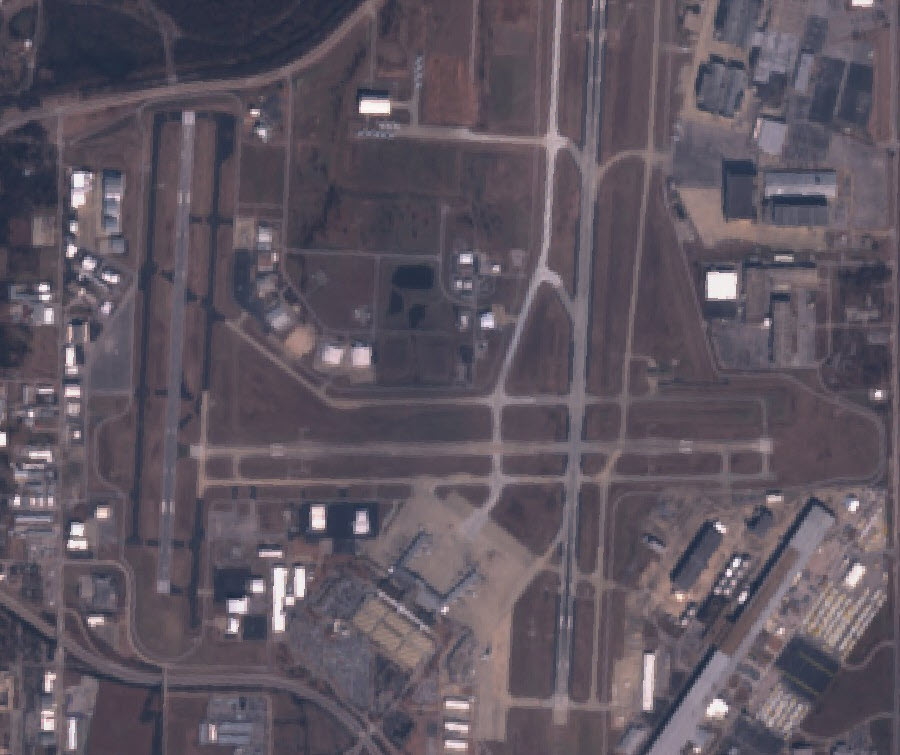
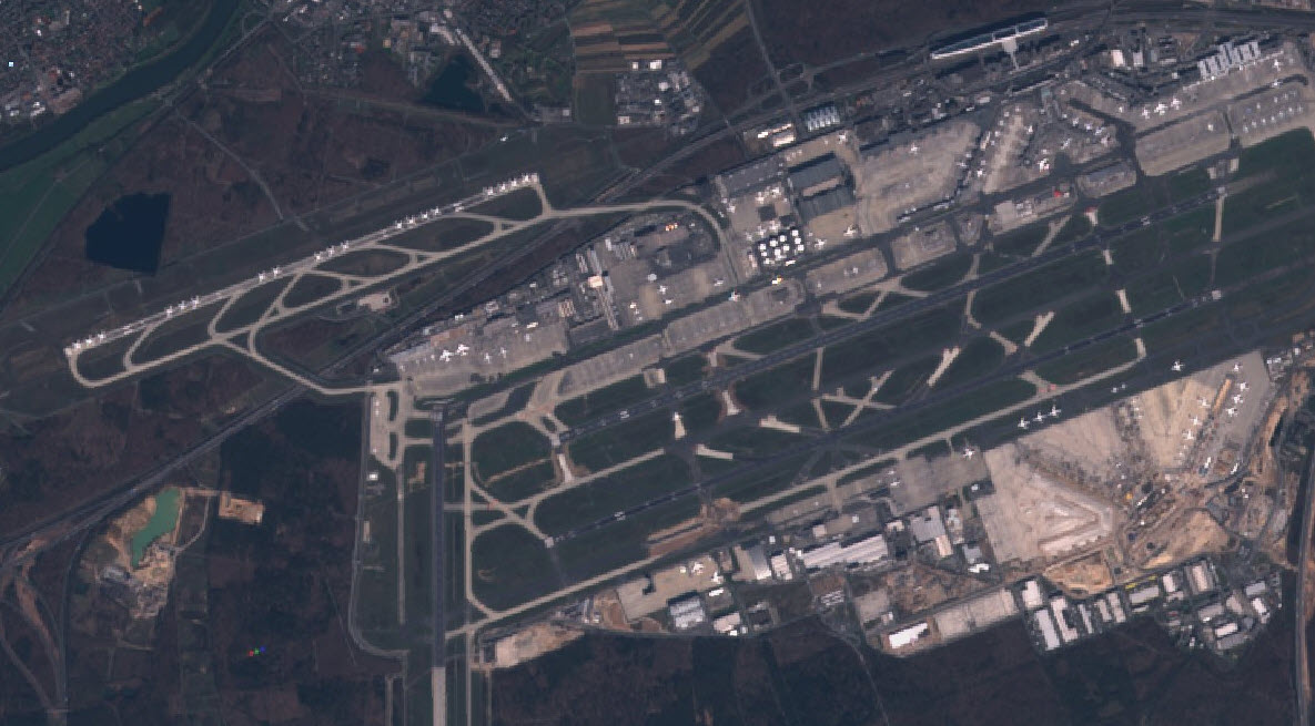
A runway at the Frankfurt International Airport on January 15 2020 and March 26 2020 (Source: Sentinel Hub Playground) 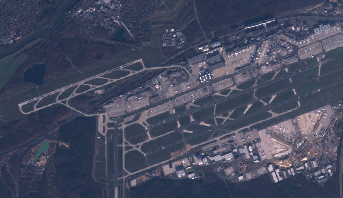
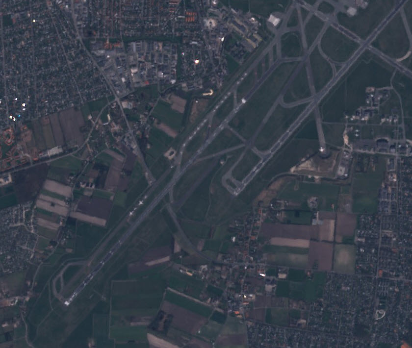
A row of aircraft parked on a taxiway off a runway at Copenhang’s international airport. The comparison is between January 1 and March 26 2020 (Source: Sentinel Hub Playground)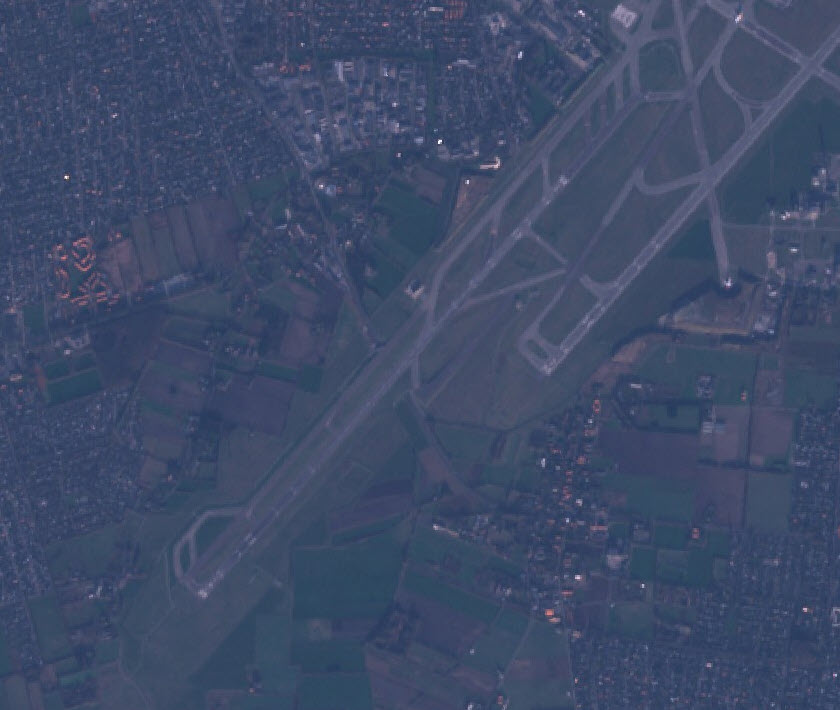
Drone Footage
With a lot of cities implementing lockdown measures to stop the spread of the virus, their streets and public spaces have emptied out. This change does not go unnoticed to the residents and for those who own a drone, it presents the opportunity to film these effects while maintaining social distance and publishing the images for the rest of the world to observe.
YouTube is a good source for finding recent drone footage of a certain area. A lot of drone owners upload their footage in a high resolution on YouTube. Here are some search results for a drone footage search on YouTube:
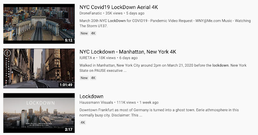
There are several ways to search for footage that show the effects that COVID-19 has on different cities. Drone footage is often uploaded using the words “Drone” or “Aerial”’ combined with the quality of the footage (4K, for example). You can combine keywords to get the best search results for the videos you are looking for. Using “Covid19” or “Coronavirus” seems to produce a lot of the same results, as does “Lockdown”. The best way to ensure you are getting drone footage (and not a random person walking around with their camera) seems to be by adding “4K” into your search query.
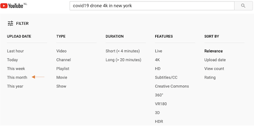
If you want to make sure you get drone footage from the last couple months, you can use the filter YouTube provides for their results:
Here is an example of the kinds of drone footage you can find, showing the beauty and eeriness of an empty city:
Conclusion
While it seems the whole world is at a standstill because of COVID-19, the examples above show that the world of open source is still moving at a fast pace. You can use these techniques to explore the world of COVID-19 while you’re in the comfort of your own home.
At first glance, these images can be unnerving, creepy, and perhaps even frightening. It feels like the world that we have come to know has changed overnight. Sailing through the sky with a drone, looking at the empty streets below, or watching the world’s most famous and beautiful landmarks stand alone with no one to appreciate their beauty can bring up negative feelings. Yet the images also reveal that people around the world are taking the threat of the virus seriously, and are staying home despite the difficulties this may pose for them and their financial situations. There is global solidarity happening around us, in order to protect one another.
The images show what might have been unthinkable mere months ago: the result of billions of people abandoning their travel plans, their daily commutes, and even their favorite restaurants. In this sense, the images show that we are all in this together.
We recommend looking through these images, using open source tools and techniques, to remind yourself of what we are all doing for each other. Take a moment to appreciate the global slowdown — and maybe teach yourself new tricks in the process.
Bellingcat team members Giancarlo Fiorella and Annique Mossou contributed to this report. The team would also like to thank Newsy’s Jake Godin and Jennifer Smart.